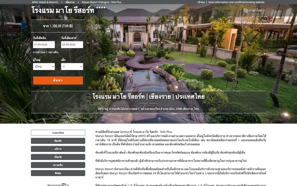
01
Opening and booking panel
A white booking panel floats on the garden photograph, two date fields and an orange search.
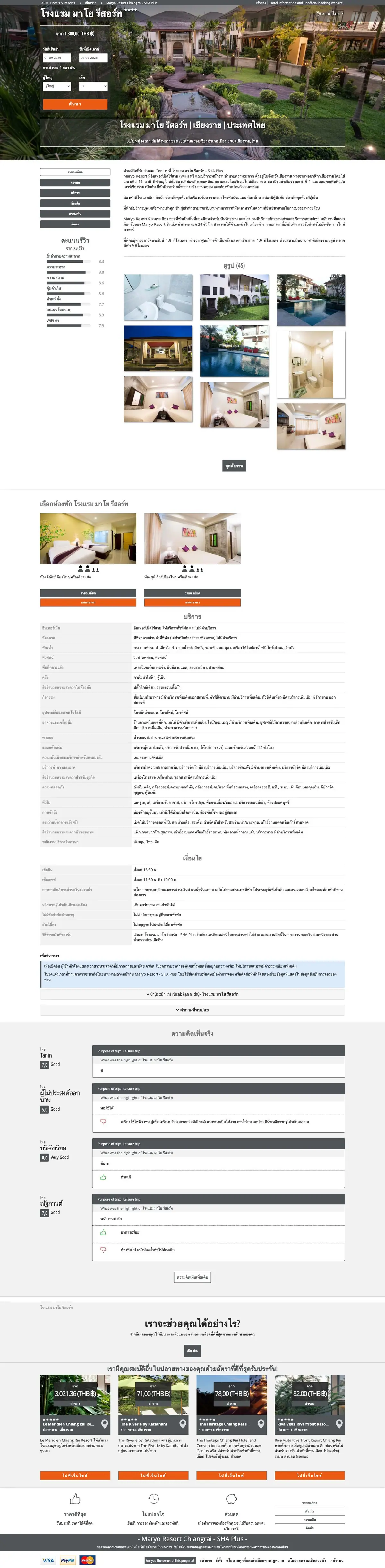


On every screen
From a first impression to the details of the stay
Maryo Resort opens on its garden and moves straight to the practical side of a stay. Room photographs, accommodation details and a date search sit on one path. A guest sees the real spaces before taking the next step.
The site, read one section at a time. What each one is for, and the one thing the design does there.
01
A white booking panel floats on the garden photograph, two date fields and an orange search.
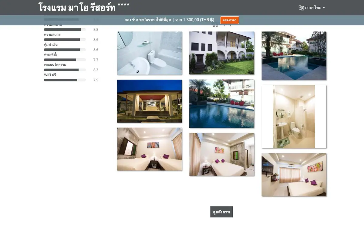
02
Seven labelled score bars left, nine photo tiles right. No prose between them at all.
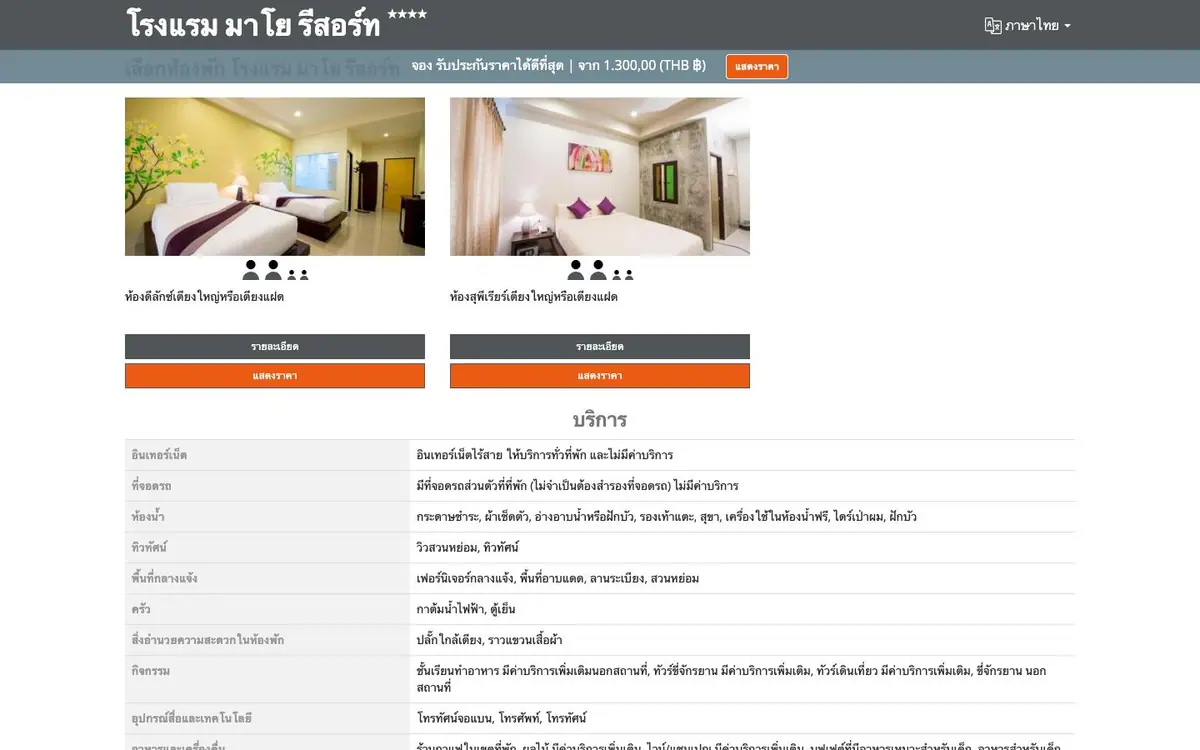
03
Two room cards with orange booking buttons, then a services table in two ruled columns.
04
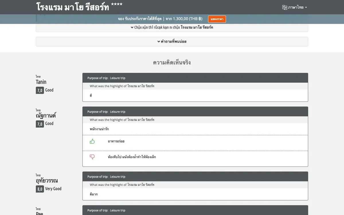
Cards one under another: the name and a score chip left, the comment right, votes beneath.
05
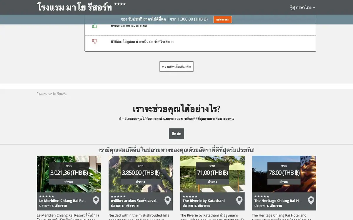
Ticks and crosses summarise the property, then four other hotels with prices in baht over them.
06
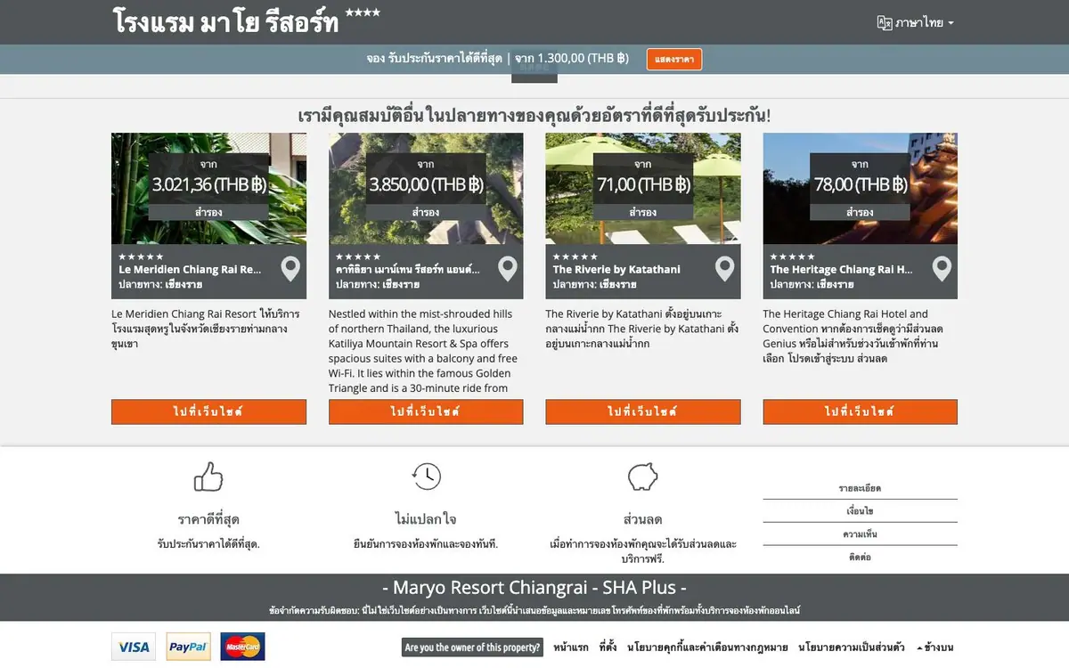
Three line icons, a dark bar naming the SHA Plus certificate, then the payment marks.
Every colour was read off the rendered page and weighted by the area it paints. Photographs are not in it.