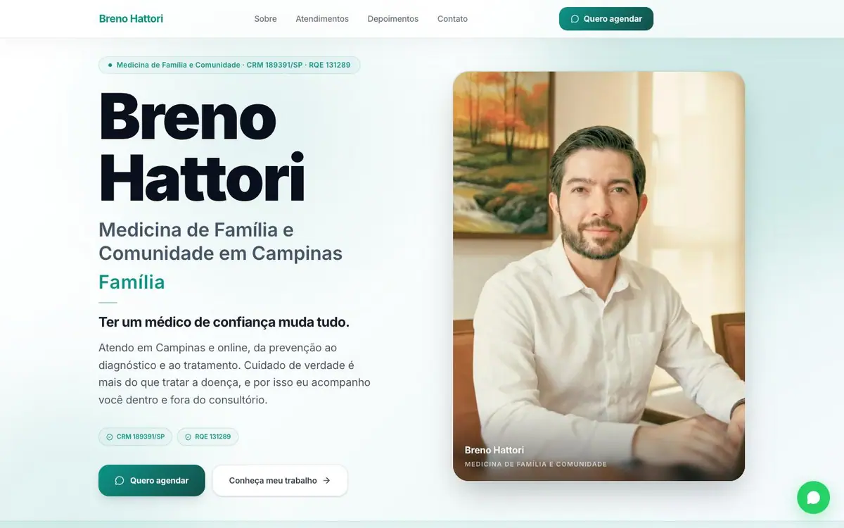
01
The opening
The doctor's name set very large in sans, a portrait card beside it, two green credential chips.



On every screen
A personal introduction, built on trust
Breno's site presents family medicine through the person behind it. Portraits, clear headings and a soft teal palette make it professional without being cold. The page explains the doctor's approach and the care on offer, and keeps the appointment contact close.
The site, read one section at a time. What each one is for, and the one thing the design does there.
01
The doctor's name set very large in sans, a portrait card beside it, two green credential chips.
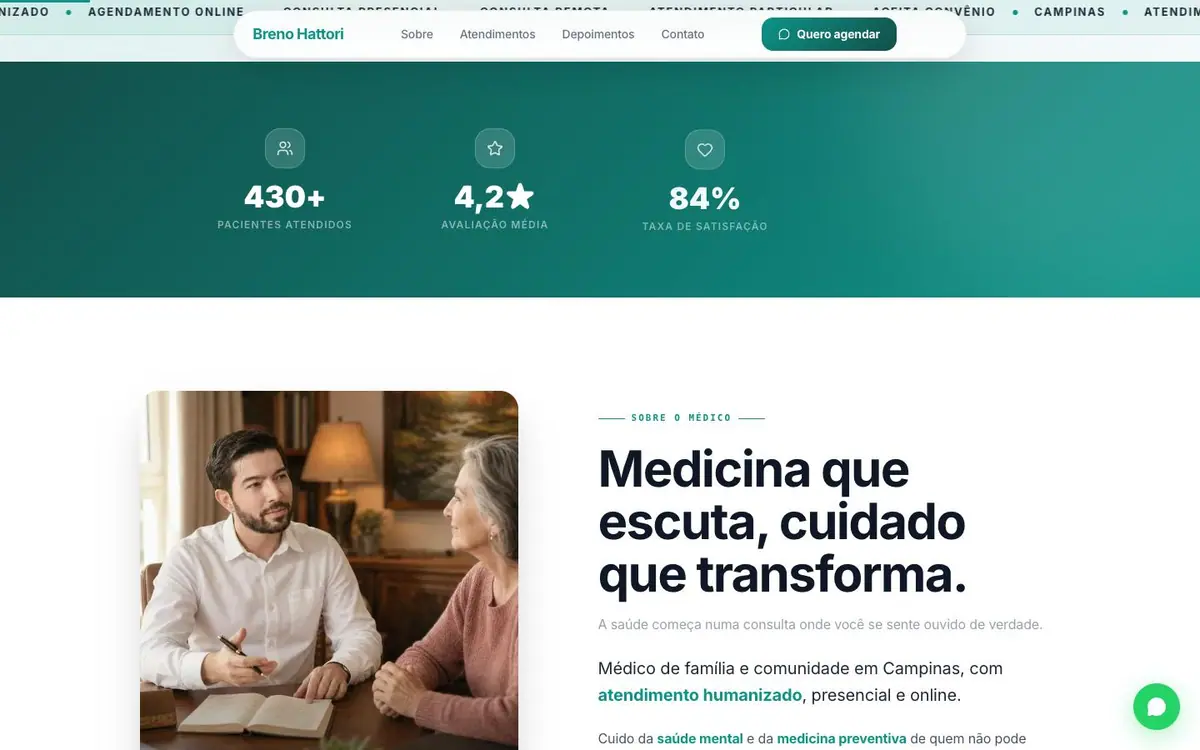
02
A green band marquees short labels and carries three figures: patients seen, rating, satisfaction.
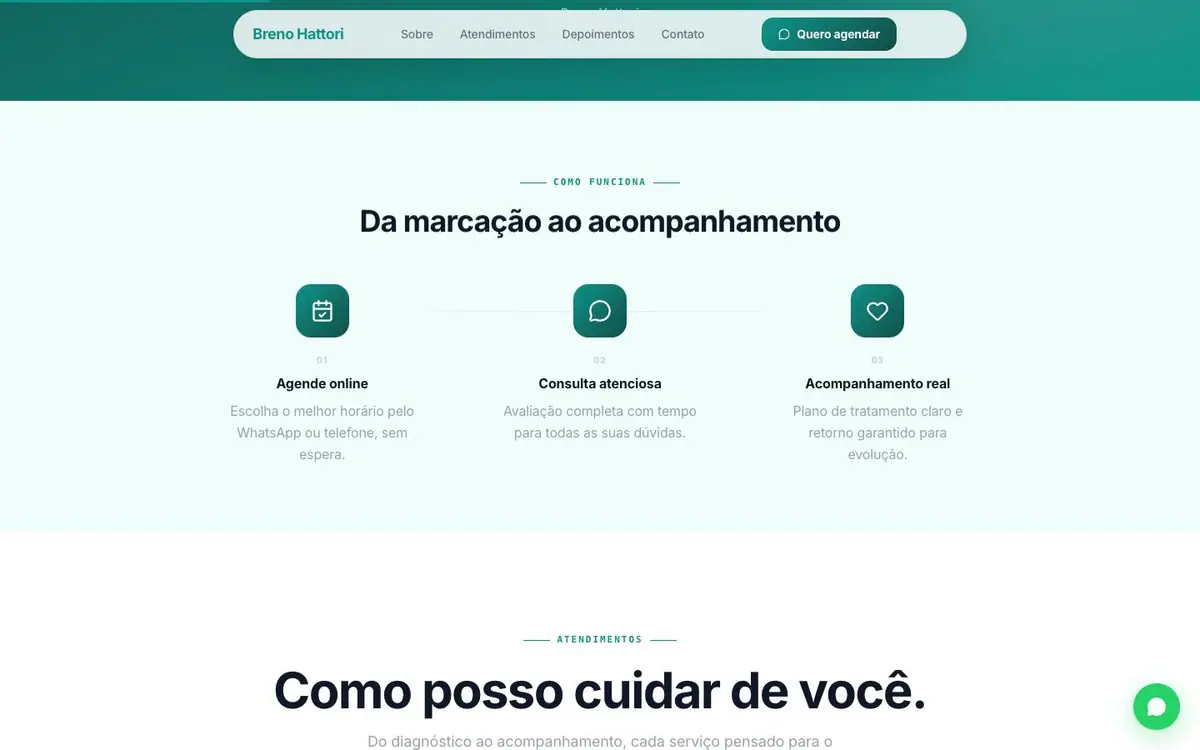
03
Mint ground, three icons in rounded squares, three lines each. Booking, the consultation, the follow up.
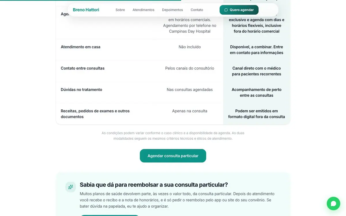
04
Five rows, insurance in the middle, private shaded and slightly wider. The table does the choosing.
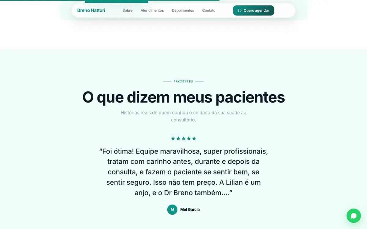
05
Mint ground, five stars, a testimonial of seven lines with the whole width to itself.
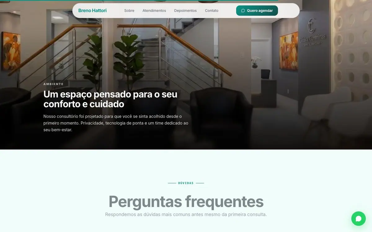
06
One wide photograph of the room, warm and low lit, the headline over its lower left.
Every colour was read off the rendered page and weighted by the area it paints. Photographs are not in it.