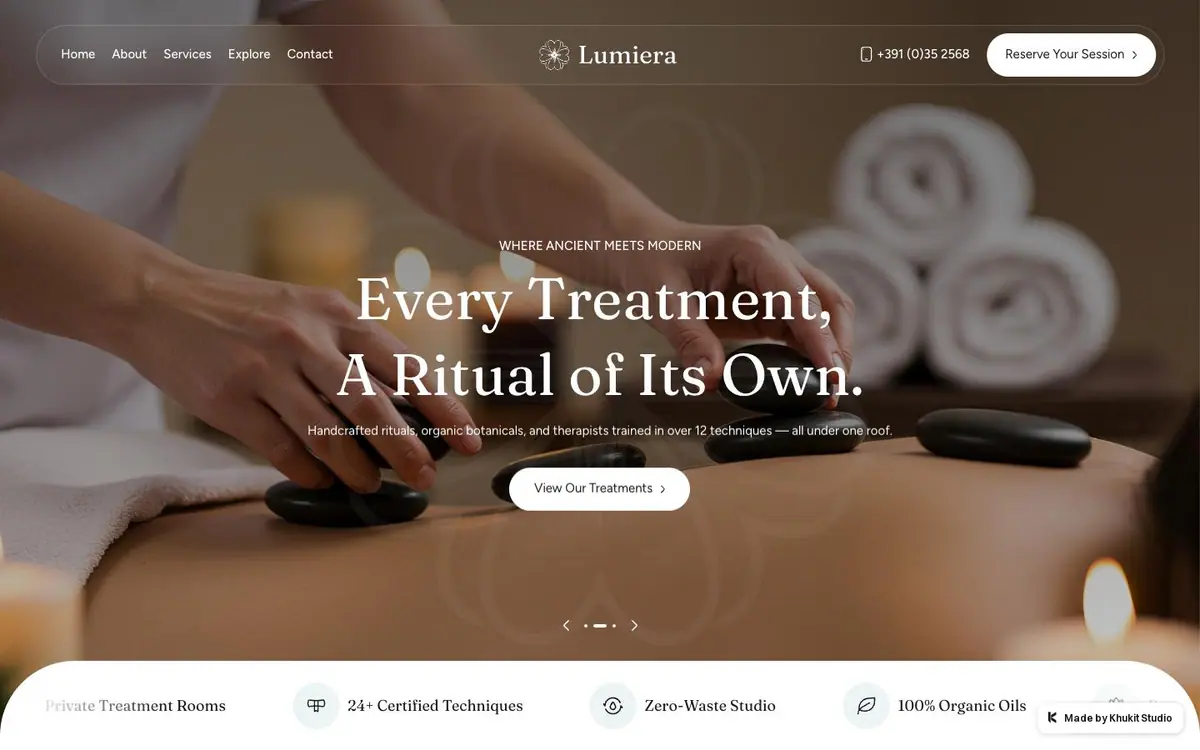
01
The opening
Towels, candles and stones, a rounded floating nav, and four icon claims on a white bar.



On every screen
The feeling of a spa, before you arrive
Lumiera brings the atmosphere of a spa into the first moments on the page. Treatment photographs, warm accents and generous space give it a quiet quality. Service previews, the team and visible booking prompts connect that feeling to what a visitor needs to know.
The site, read one section at a time. What each one is for, and the one thing the design does there.
01
Towels, candles and stones, a rounded floating nav, and four icon claims on a white bar.
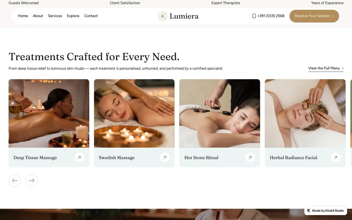
02
Four cards in a row, a photograph, a name and an arrow. No price on any.
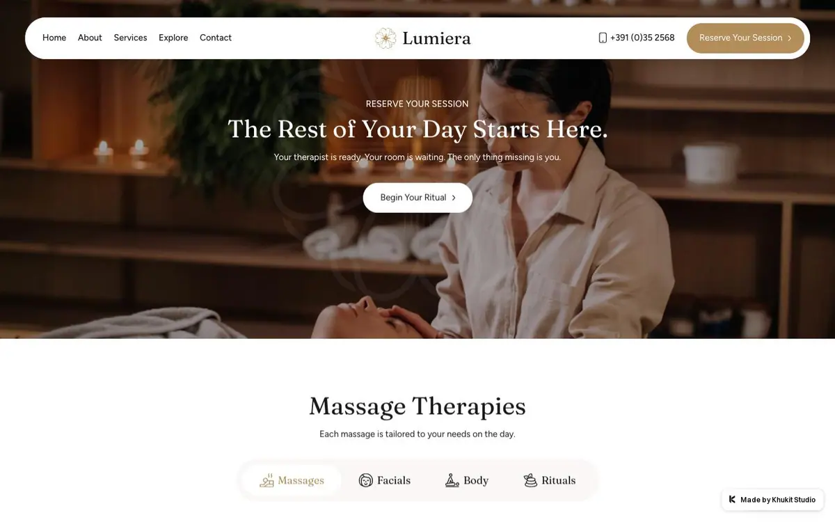
03
A face during treatment, full width, with the heading over it and four pills underneath.
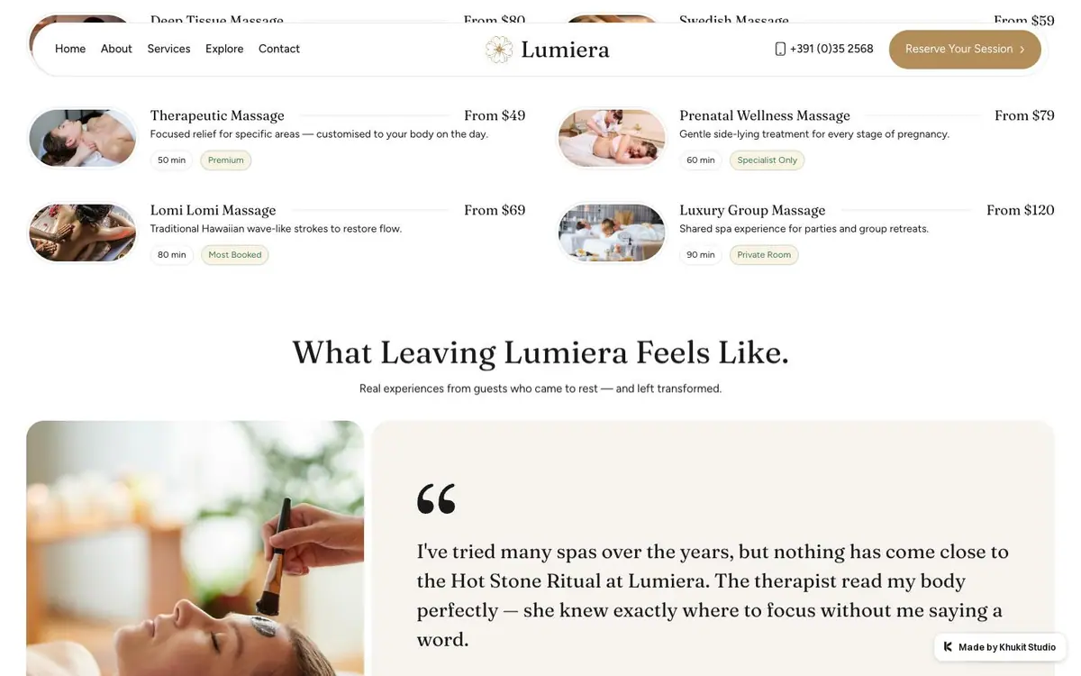
04
Rows of thumbnail, name, duration and a From price, then one quote with a large quotation mark.
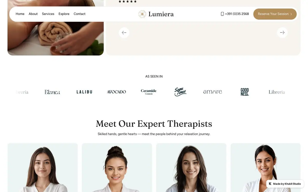
05
Eight grey wordmarks under an As seen in label, then four portraits on pale blue.
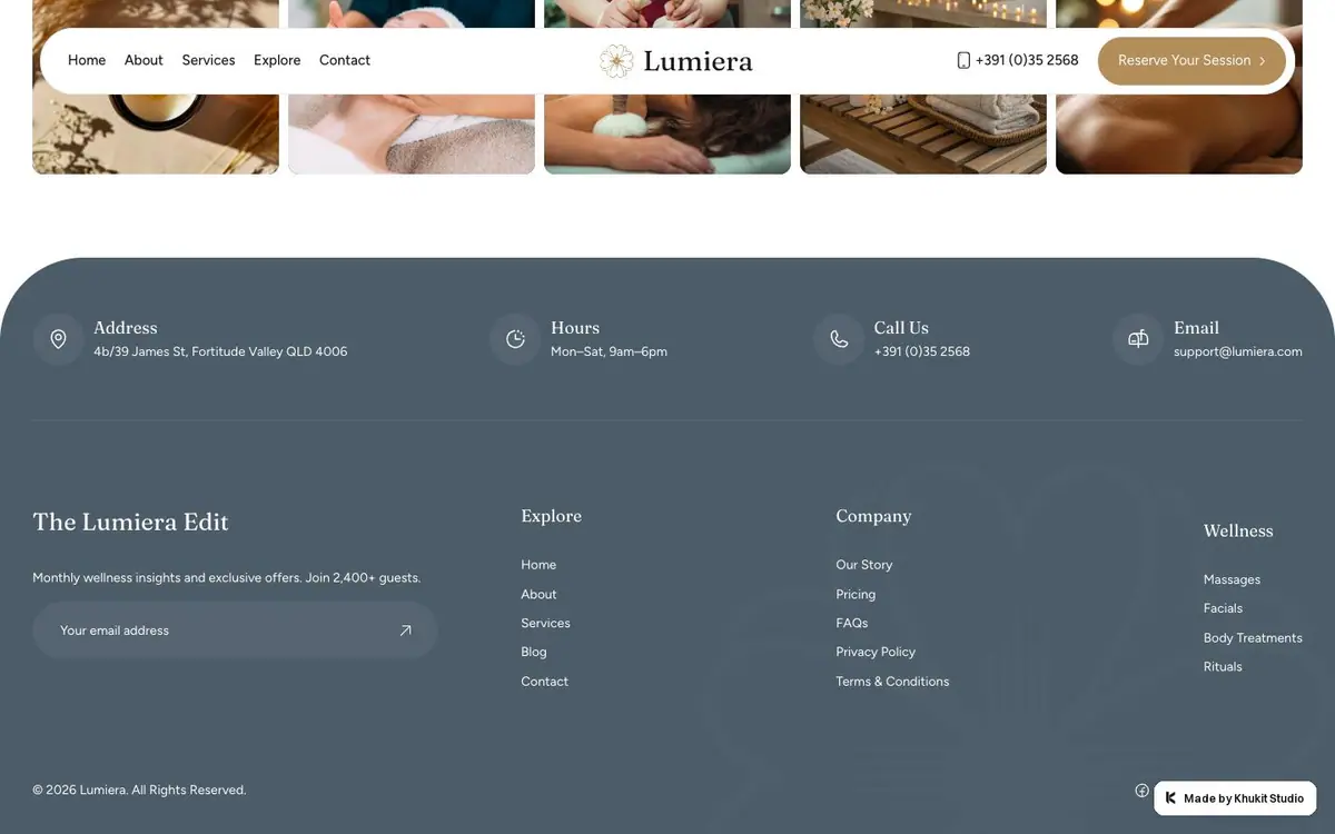
06
A dark blue band of four contact blocks, then the newsletter field and three link columns.
Every colour was read off the rendered page and weighted by the area it paints. Photographs are not in it.