01
The opening
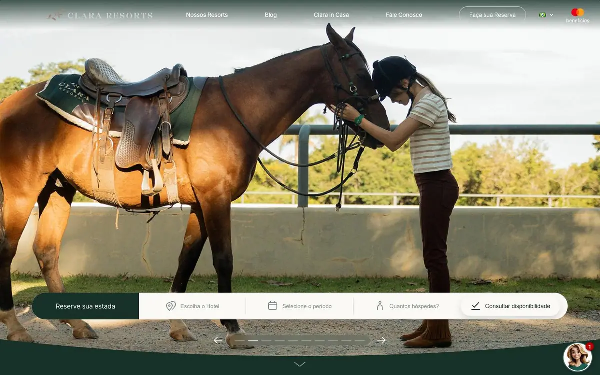
We opened with one large photograph and a place for the dates, and nothing else. A guest should feel calm from the first second, not busy.



On every screen
Nature, family time and a taste of the place
Clara Resorts has three houses in nature. Families go there to rest and to spend time together.
The resort wanted a website that shows the pleasure of slowing down. A family should feel the calm of nature, the time together and the taste of the food before booking.
We let the photographs speak first, and we kept the text short. We used the green of the forest on every screen, so the website feels like the place. We gave each house and the restaurant a section of their own, so a family sees the whole stay.
We wanted a guest to feel the peace of the forest before the first click.
Calm, close to nature, and together with the family. These three feelings guided every choice of colour, photograph and section.
These are six sections of the website, in the order a guest sees them.
01
We opened with one large photograph and a place for the dates, and nothing else. A guest should feel calm from the first second, not busy.
02
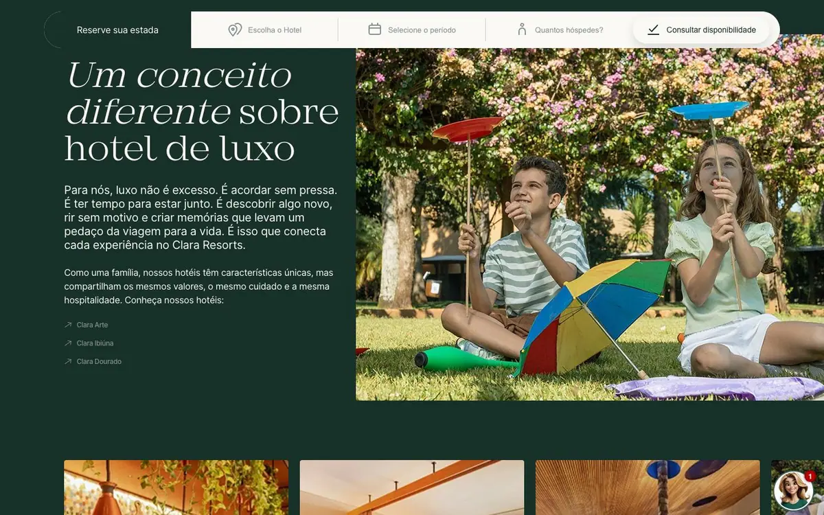
We wrote a few lines about what kind of resort this is, on dark green. Three photographs next to the text make the guest want to be there.
03
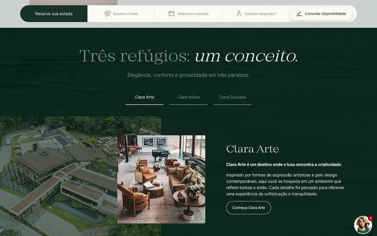
We gave each house its own tab, its own photograph and its own button. A family imagines itself in each house, and chooses one.
04
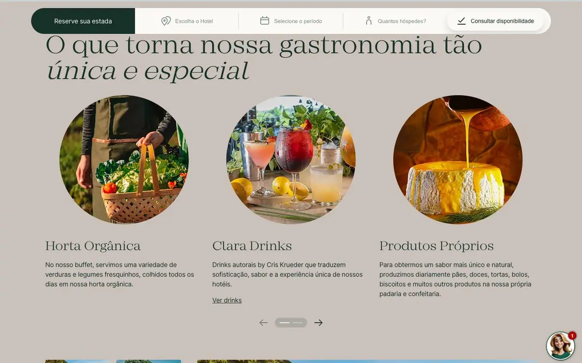
We showed the food in three round photographs, the only round shapes on the page. The guest notices that the food is special here.
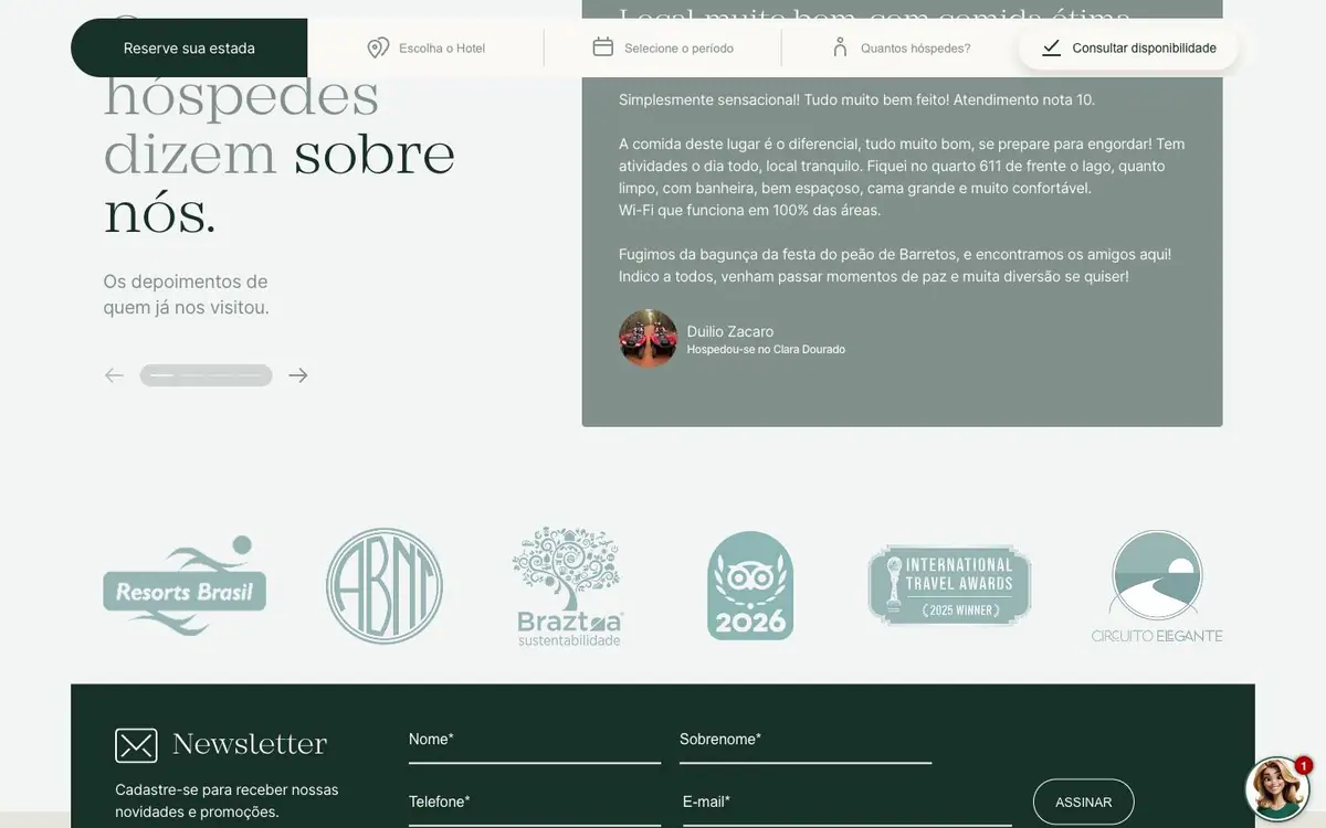
05
We put one guest's words before the logos of the awards. A new guest trusts a person first, and a prize second.
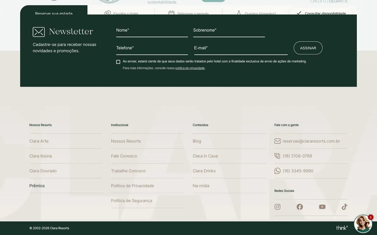
06
We ended on the same green that opens the page. A short form lets the resort write to the family later and invite them back.
We used the colours of a forest. A guest feels rested and close to nature before the trip begins.
For the titles we used a typeface with thin, tall letters, so the titles feel elegant and quiet. The small text uses Inter, which is easy to read on a phone.The photographs are large and fill the screen. We gave them this space because a family looks at the pictures before reading the text.
A family sees the three houses, the food and the landscape on one website, and feels the stay before booking.